Sacha / Project 04

Schweetie


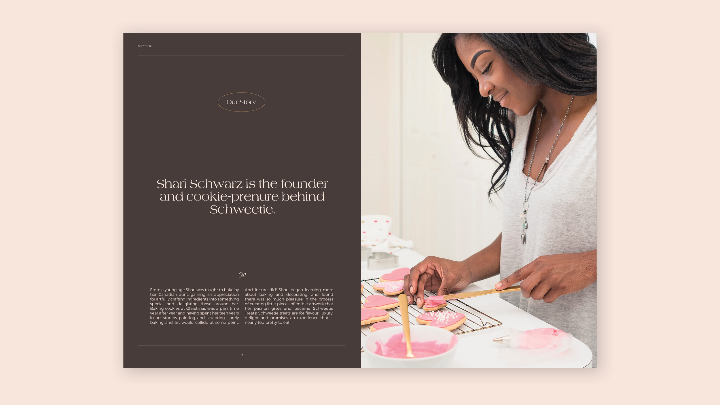
Schweetie is an artisan cookie brand, focussing on special events. The brand needed a brand DNA to form its foundation, as well as a visual brand identity. It was important that the new brand will allow for longevity and for the business to grow into different areas, anything sweet treats related.

Brand DNA
Brand design
Styleguide

Together with Schweetie’s founder, Shari, I workshopped on the brand DNA, which holds the core of the brand. It’s an important exercise and allows a founder to think in-depth about the future of the brand and what it stands for. Once we established the brand DNA, I had a solid foundation that helped me in creating the visual identity.

The brand’s visual identity is sweet and cute, without being over the top. The goal was to strike a nice balance between an artisan, handmade feel as well as luxury, as Schweetie’s treats are high end and hand made. Using the pink colour reminds us of fluffy sweet marshmallows, whilst the striking red font on top of it brings an element of surprise and cheekiness to the brand. With the brand imagery we want the cookies to speak for themselves as they are little pieces of art! The brand imagery will be supported by light textures where needed.

Previous
Previous

Read & Bell

Next
Next

Super Cubes