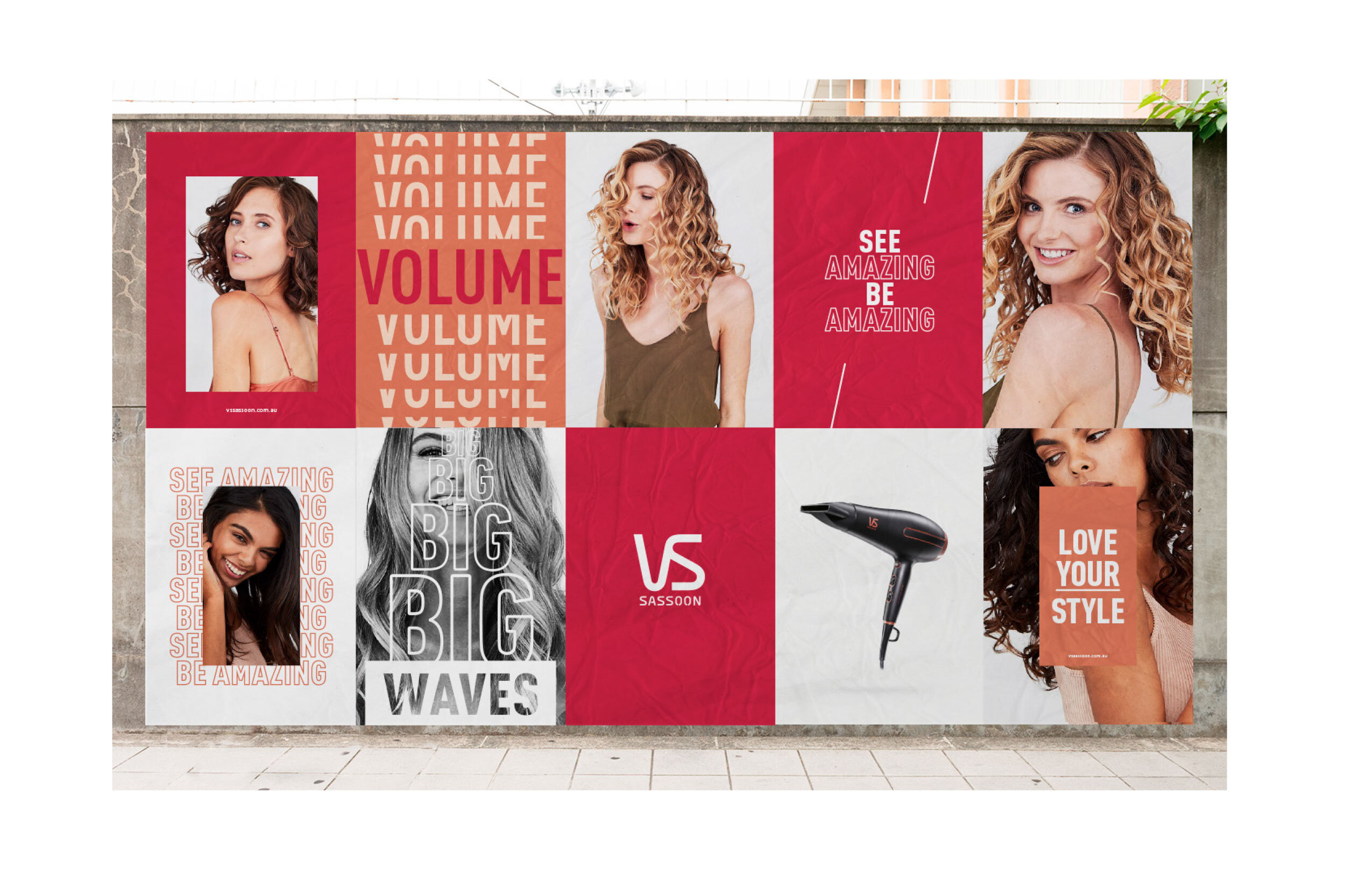
In the age of of ‘fearless girls’ and female superheroes the time was right for VS Sassoon to play their part in female empowerment. Therefore, the brand decided to have a full rebrand to tie in with the sprit of the time.

SACHA was able to lead and execute the creative direction of their rebrand, creating a fresh new look for their packaging, a wide range of new model imagery, point of sale material and online communication assets, whilst keeping strong brand elements in tact, such as the VS Sassoon logo and iconic red colour.
Together with a brand strategist we did thorough research in the competitive landscape to see where VS Sassoon stood out, what worked and what didn’t work and – most importantly – where the opportunity for improvement lied. We did a multi-day photoshoot where the goal was to end up with over 130 new final images that would be used across all packaging, POS and marketing material, and are timeless enough to last for the next decade.
We captured engaging and confident imagery, and used models with a natural look with the goal to step away from the standard ‘pretty' girl’ that is seen on hairdryer packaging of competitor brands.
Services
Brand design
Art & Creative direction
Styleguide
POS design
Packaging design
Content
Photography
Natalie Cottee
Videography
Patrick de Teliga
Motion Graphics
Daniel King