AZPR is a Southern Highlands-based public relations agency helping businesses shape meaningful stories, build visibility and create lasting connections with their audiences. Working across strategic communications, media relations and brand positioning, the agency needed an identity that reflected both the calibre of its work and the personality behind it.
The new brand was built around a balance of confidence and approachability: polished without feeling corporate, and sophisticated without losing warmth.
At the heart of the identity is movement. Founder Anna is a keen horse rider, which became an unexpected starting point for the brand's visual language. Rather than referencing the equestrian world literally, the identity draws from the qualities of a horse in motion: powerful yet controlled, fast yet steady, and graceful in its momentum.
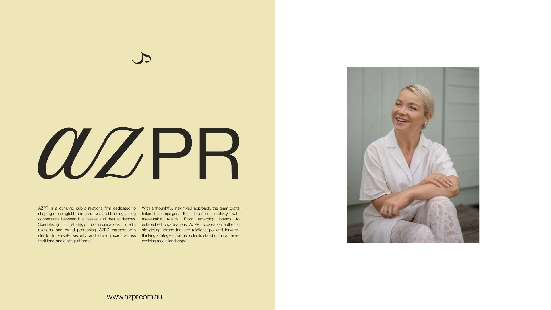
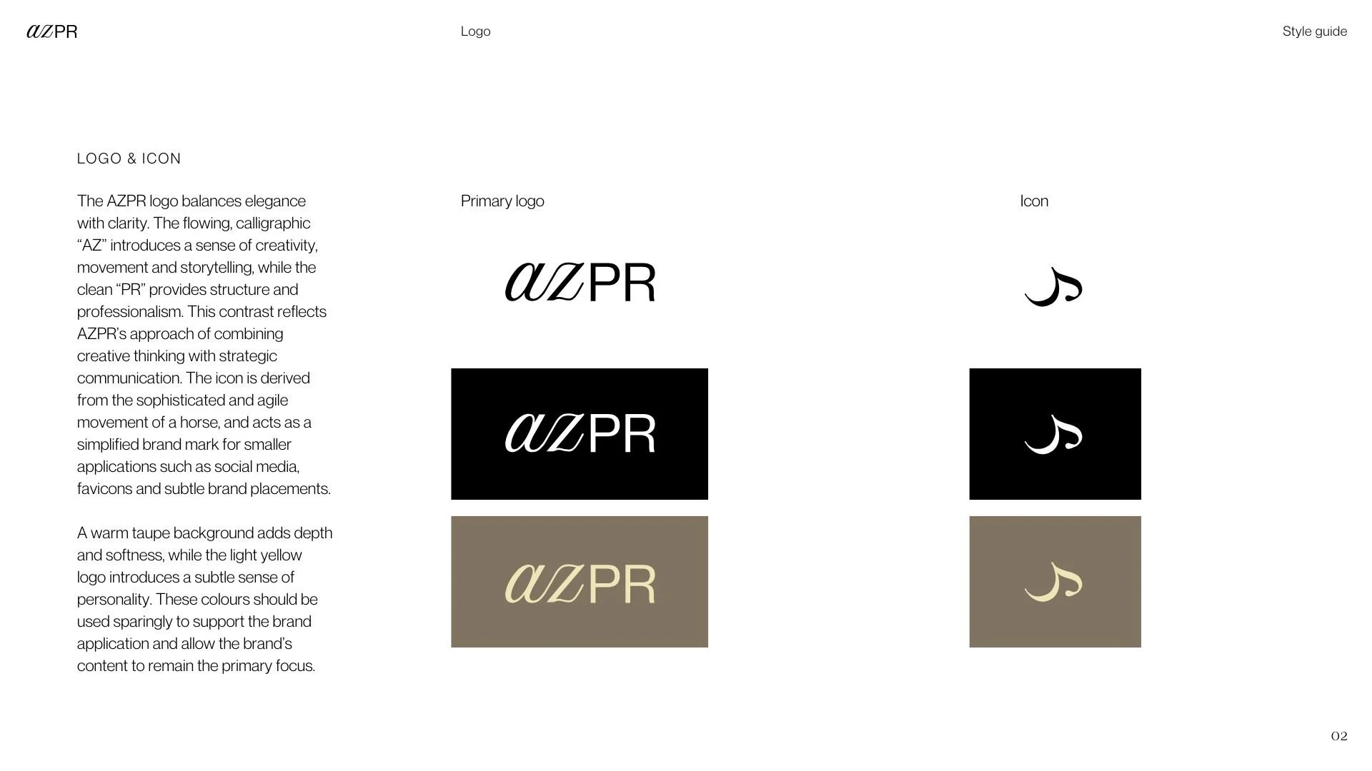
This thinking informed the brand icon: an abstract symbol designed to suggest forward movement and the rhythm of a horse in motion. It creates a subtle personal connection to the founder while also representing what good PR does: building momentum, moving stories forward and creating impact.
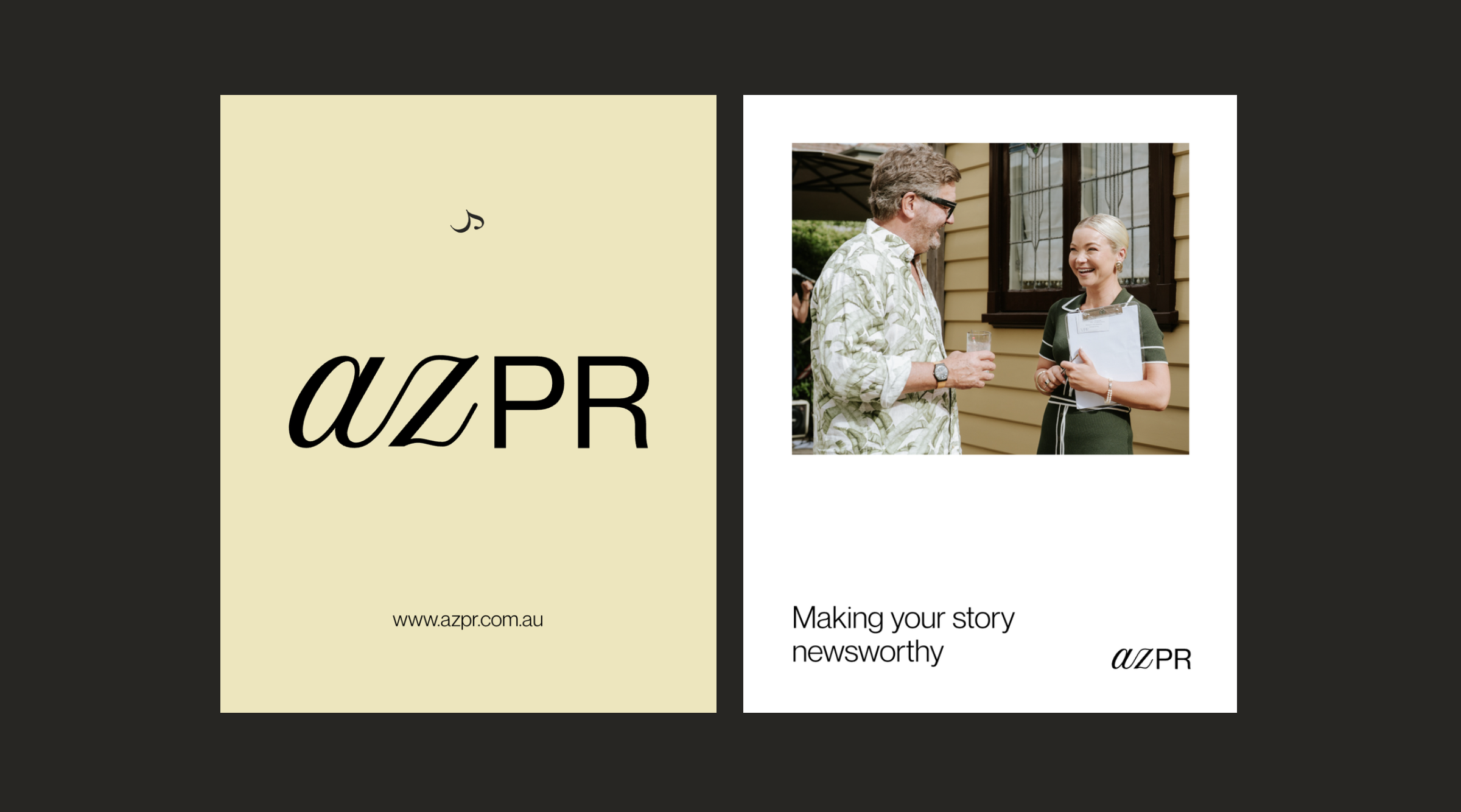
The AZPR wordmark combines expressive typography with a more restrained, contemporary form, creating a visual tension between personality and professionalism.
Paired with an expressive wordmark and a muted palette of soft yellow, stone, earthy brown, and near-black, the identity balances personality with professionalism. The result feels refined and established, without becoming overly corporate.
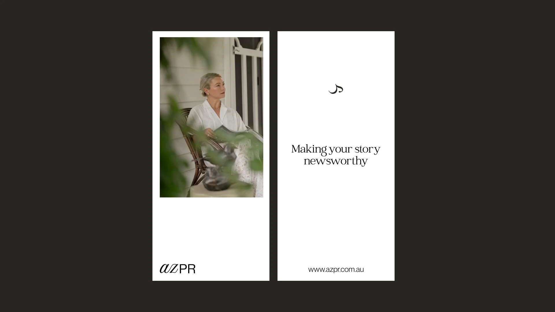
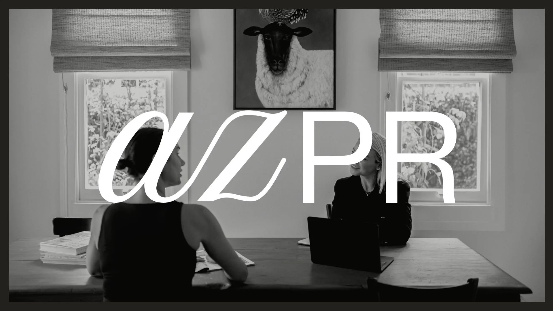
The identity was carried through to the art direction of a brand and headshot shoot, balancing polished portraits with more candid, editorial imagery.
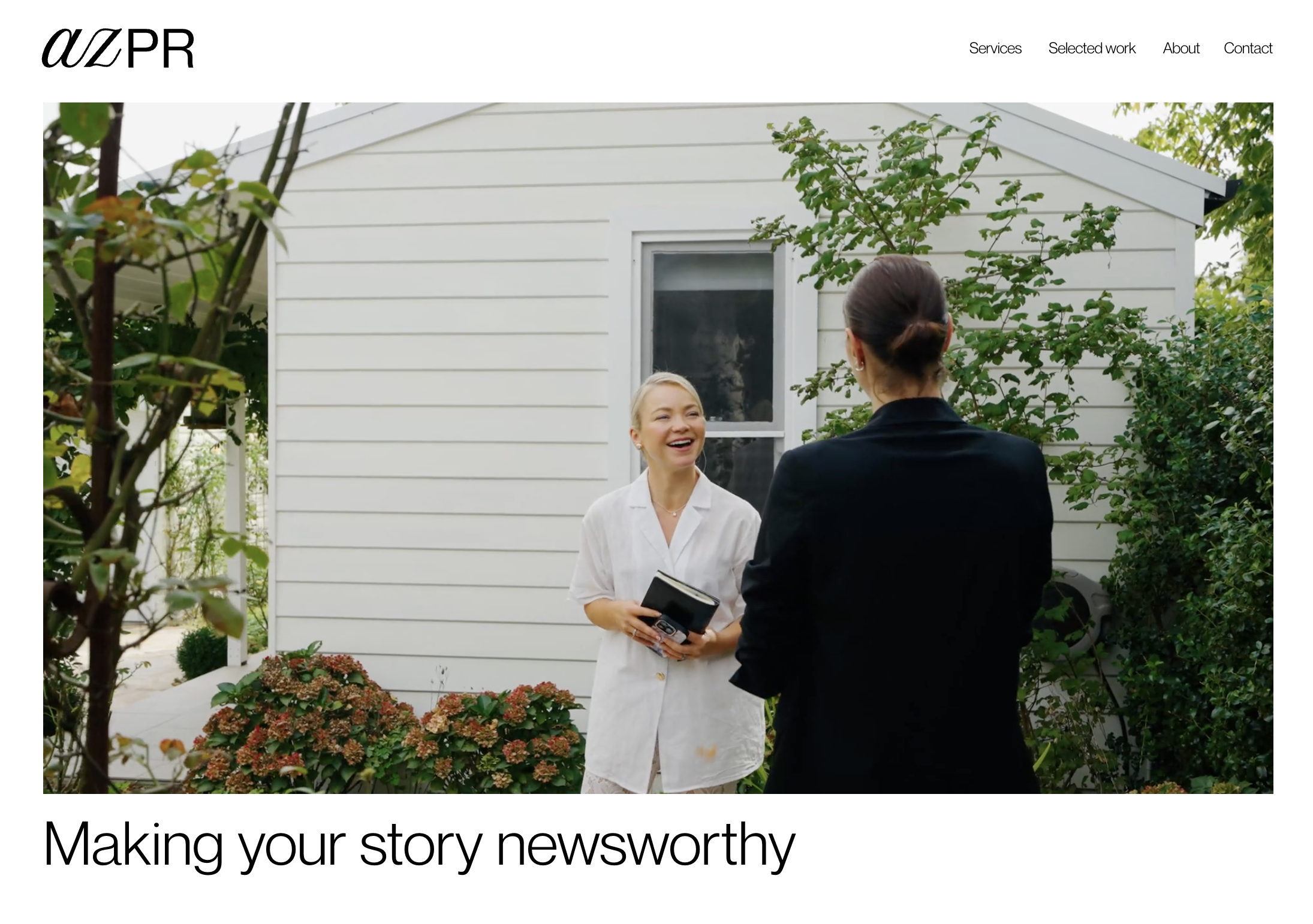
The new website brings these elements together through generous layouts, expressive typography and photography, creating a cohesive digital home for AZPR that feels established and credible, while retaining the personality behind the agency.
Services
Brand design
Style guide
Art Direction
Website design
Photography
Bodhi Todd